Soul & Pepper is a riff on salt and pepper — the most essential seasoning duo in any kitchen. Salt is the base. We swapped it for soul, because a brand's soul is its base too. And if soul is the foundation, pepper is what we'd bring to it: the spice, the kick, the thing that makes it actually taste like something.

That logic became the tagline: You bring the soul. We bring the spice.


The logo is built on two typefaces with very different styles. SOUL& is based on Juniper Std, a typeface rooted in wood type tradition that feels rustic and theatrical. I took it a bit further — adjusted the letterforms and loosened the spacing, so that it breathes a bit more. The result feels fun, fluid, and a little unpredictable. PEPPER comes from HWT Konop: bold, geometric, monospaced. Where Juniper feels handcrafted and expressive, Konop is architectural and uncompromising.

I gave the two parts of the logo two temperaments, so that the feeling of the typefaces reflects the words themselves, while creating an interesting visual collision in the process.


The logo is also deliberately unfixed in space. SOUL& and PEPPER can sit stacked, spread apart, scaled up, scaled down, or thrown to opposite corners of a layout. The only rule is that both parts always show up together — that's what makes it feel like one name.


The palette was designed to live alongside food photography, not compete with it. Six colors named after ingredients: Chili Paste, Peach Cream, Lemon Tart, Cool Mint, Kale Leaf, and Black Pepper. Lemon Tart and Black Pepper are the two primaries — and in a way, they actually mirror the brand name itself. I also pulled the palette slightly cooler and more electric, away from the warm, saturated tones you'd typically expect from food branding. That contrast is intentional: the colors hold their own without ever overpowering the food.

The logo variants with different colors also translate naturally into stickers. We actually had the ambition to stick them onto walls across Berlin, and we even got them made. Sadly the agency didn't last long enough to see that happen — but looking at the mockups now, it still feels exciting.

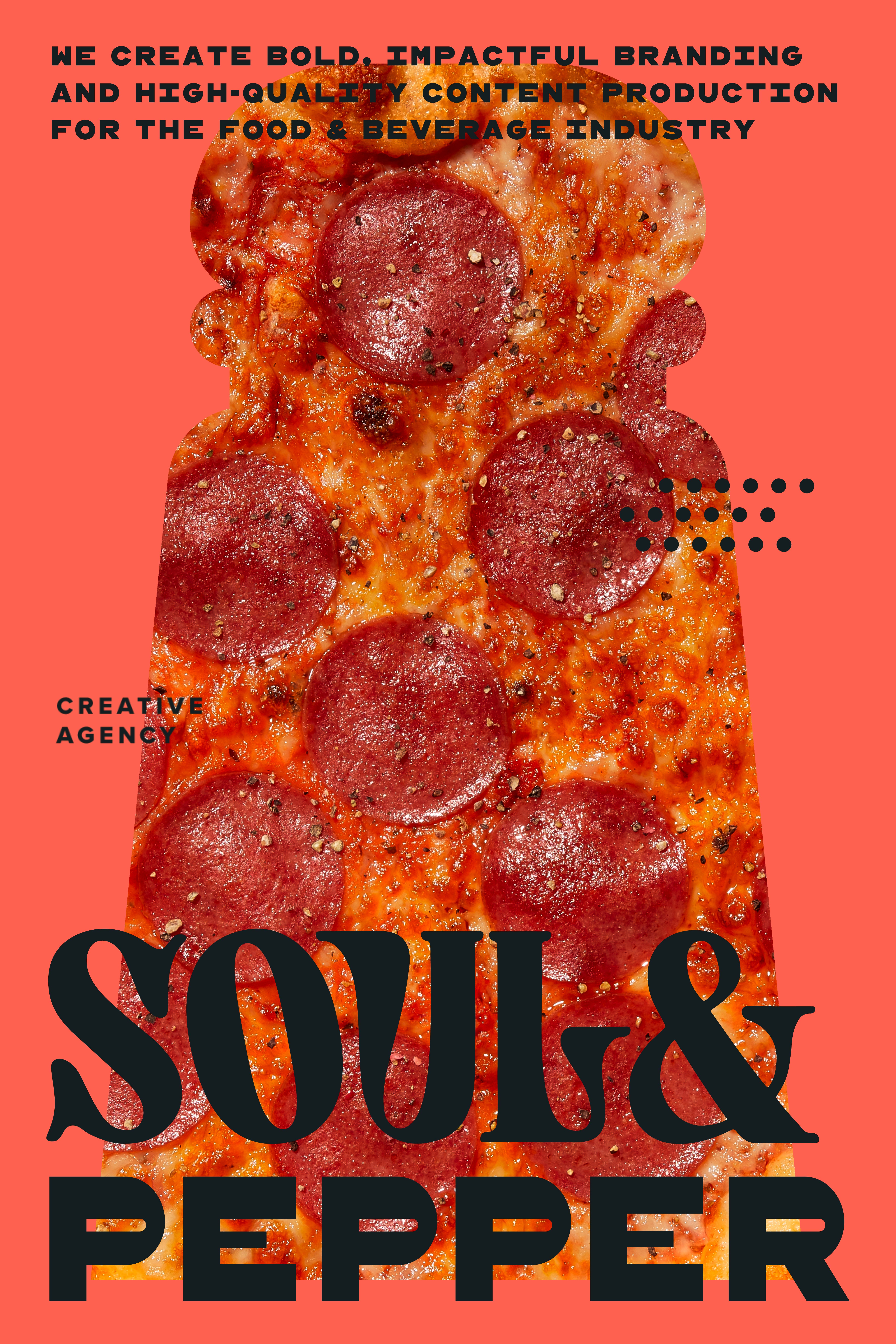
Put the logo system, the color palette, and food photography together — and this is where things get interesting. Finding the right color, the right layout, the right crop for each image is genuinely fun to figure out.


To make this repeatable beyond a handful of hand-picked examples, I built a set of templates — flexible enough that the brand could drop into any food image and immediately own it.

This application was primarily for posters and social content, which made sense for an agency that leads with visual boldness. What I enjoyed most was how consistent it still feels across all the different combinations — swap the food, change the color, flip the layout, and it's still recognizably Soul & Pepper.


Alongside the logo, I created a set of graphics for the brand — the pepper grinder and shaker felt like a natural fit. I made them silhouetted, bold, slightly oversized, and left plenty of room to play with how they're used: flat as layout elements, or as clipping masks with food photography inside. There's also a dot pattern in there, a nod to peppercorns. Together they form a graphic toolkit — there when you need it, easy to leave out when you don't.


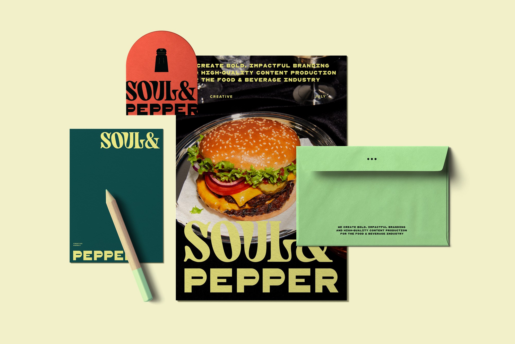
For the physical collaterals, the idea was simple: stay colorful and bold. The business cards stick to the two primaries — Lemon Tart and Black Pepper — the most recognizable combination, and the one that needs to stay recognizable. Everything else is fair game: an envelope, a gift bag, or a notepad can each take any color from the palette. The logo, the typography, and the layout are what hold it all together. Everything reads as Soul & Pepper without any two pieces looking the same.


We built the website on Squarespace, but when the agency paused, the site went down with it. Unfortunately no screenshots survived — but the copy did, and I'm sharing it here because it still captures the spirit of the brand better than any screenshot could:

Soul & Pepper paused four months after it launched. That might not look like success by the usual standard.
But this remains my favorite project of 2025. It started with just my colleague — one person, freshly laid off, deciding to build something of her own. Then slowly, a few of us former colleagues joined in, each bringing a piece to the table, and a real little team started to take shape. What made it feel different from a typical client project was that I had a real stake in where it ended up — not just as a designer, but as part of that team. I was listed on the website, involved in decisions, and genuinely invested in where the whole thing was going. That meant fewer guardrails, more room to take risks, and a kind of care for the work that's hard to manufacture when you're on the outside.
I'm proud of the result, and I'm glad we went there.