Kitchen Stories’ brand identity was designed to connect with home cooks through a colourful and energetic visual language. For B2B communications with business partners, I wanted a slightly more grounded and trustworthy feel, while keeping the colour and energy that make it recognisably Kitchen Stories.

Logo
I adjusted the primary horizontal Kitchen Stories Business logo and added a vertical alternative, with light and dark versions of each to suit different needs. The style guide covers how to use them, including clear space and what to avoid, so the logo can be used consistently across business materials.


Color
While yellow was the primary colour of the Kitchen Stories brand, I chose deep green and beige as the main colours for B2B communications, giving them a more grounded and professional feel. Yellow, orange, and lighter greens keep the palette connected to the colour and playfulness of the wider brand.


Typography
Following the Kitchen Stories brand guidelines, I used FAM Aime for headlines and highlights, and TT Commons for body copy and supporting information. Together, they create a clear hierarchy while keeping the brand’s character.


Illustration
The illustrations for B2B communications were based on Kitchen Stories’ brand illustration library, which I had previously created together with another designer. I adjusted the colour palette, gave the characters a slightly more business-oriented feel, and drew new illustrations based on the existing assets. Everything was organised in Figma so the team could reuse the illustrations across different materials.

With the B2B visual language in place, I applied it to the materials the team needed for its day-to-day communications. Each format came with different content and tools, so I adapted the system to work across them.

One-pagers
The B2B team needed one-pagers for different offers and conversations with partners. So I created a modular system in Figma, with sections for the header, content, optional additional content, and contact information. Each section includes different layouts for text, images, key figures, lists, or offers. I also used auto layout to make the modules easier to work with, and the content sections can be combined as needed.


Newsletter
The team used HubSpot for its newsletters, but at the time we couldn’t use our brand fonts in the setup. So I chose available alternatives that kept a similar distinction between expressive serif headlines and clear sans-serif body text. I then created a separate newsletter guide covering text styles, colours, buttons, and section backgrounds, making the new style easy and straightforward to apply.


I also designed different header options and a series of CTA banners for the end of the emails. The illustrations help draw attention while bringing the warmth and playfulness of Kitchen Stories into the communications.

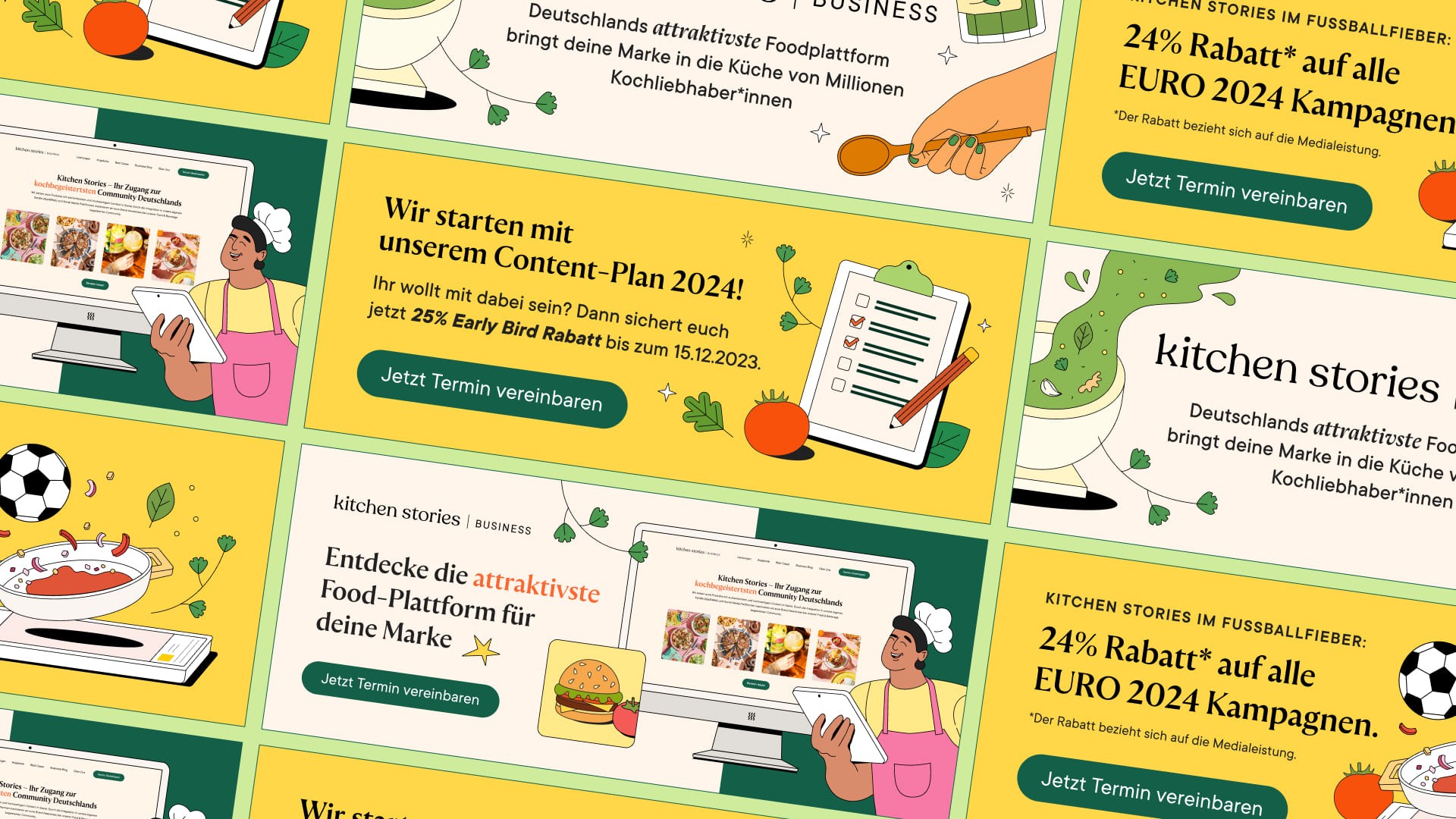
LinkedIn was one of the B2B team’s key channels for reaching partners and sharing work and updates. To support different types of content, I created post templates in Figma that could be adapted from one topic to another while keeping a consistent Kitchen Stories Business look.


I also created a set of illustrated slides that guide readers through the partnership process, from the first consultation to the campaign launch and reporting, making it easier for partners to see what working with Kitchen Stories involves.
The visual language was also brought to the business website, of course. I updated the website in Webflow together with our Creative Director. While he focused on the underlying framework and CMS, I updated the visual design and brought it in line with the new B2B style guide.
Photography
For the headers across several pages, we carefully selected some food photography from partner campaigns and displayed the images side by side. The rounded image format actually follows an existing way of presenting partner content on our brand site, with just some adjustments to the spacing. These headers bring a variety of our work into view from the start and set the tone for the website. (And of course, you can also see many more selected photos from our partner campaigns throughout the site.)

Illustrations
I also brought the B2B illustrations into different parts of the website, including the services page and the audience section on the about page. Created around the accompanying content, they bring the information to life while carrying the brand’s playful character across the site.


Data and screenshots
Numbers are important for a business website, so on the about page, I combined key figures with screenshots of the Kitchen Stories app, website, social channels, and newsletter. Together, they show partners where Kitchen Stories reaches its community and how its content appears across different channels.

This project brought together my experience creating guidelines and templates for non-design teams. It reinforced how much the practical details matter: a visual system needs to be easy to understand and use, and it also needs to work with the tools people use and the content they work with.
Testing the newsletter settings together gave us direct feedback on how the design worked in practice and where it needed adjusting. Building the one-pager system also involved gathering existing materials and understanding what the team needed, so that the modules could accommodate different kinds of content. Throughout the process, communication with the team was essential to making the guidelines and templates useful in their day-to-day work.
For me, a good system gives people a clear starting point and enough flexibility to make it their own. It can also evolve as their needs change, with feedback and continued communication helping to shape what comes next.